
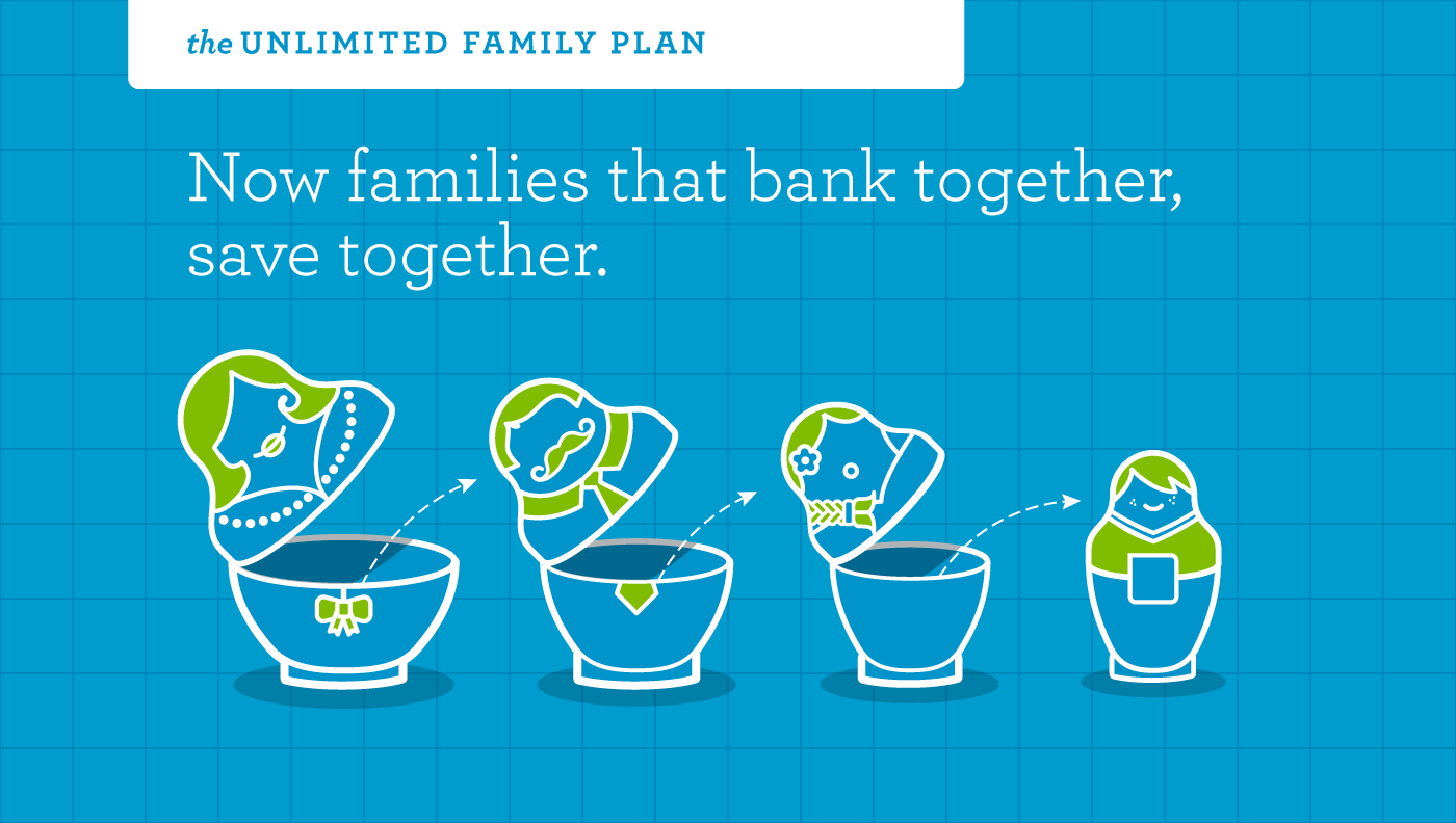
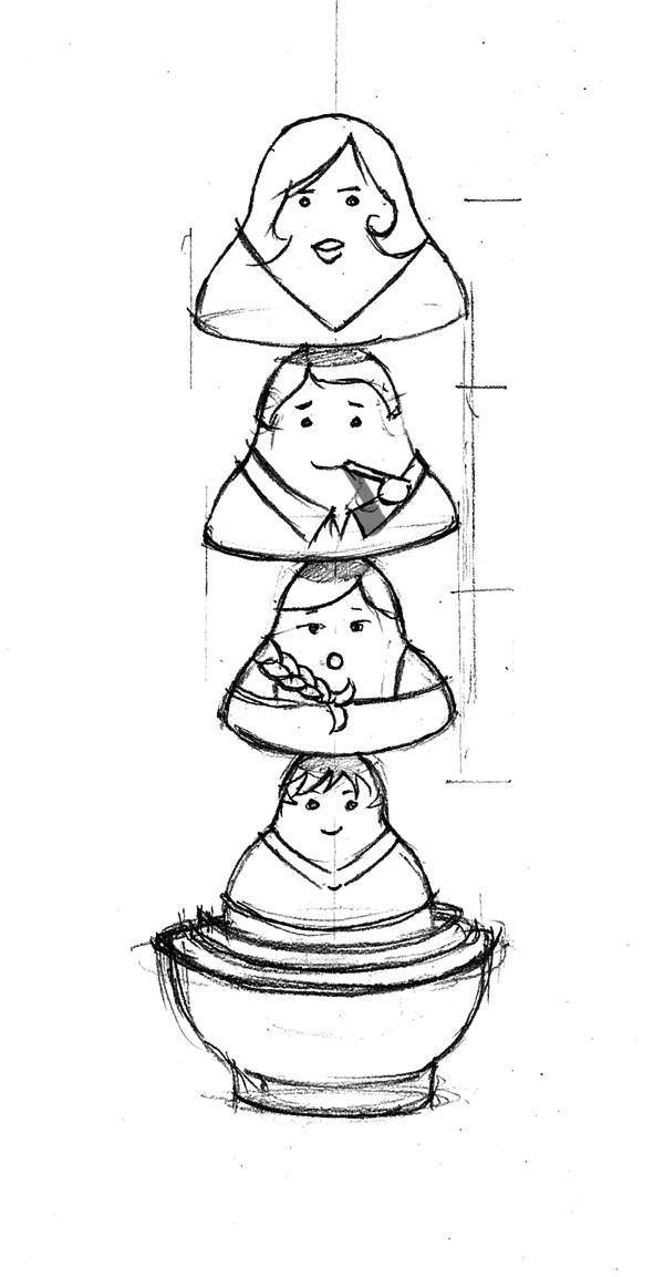
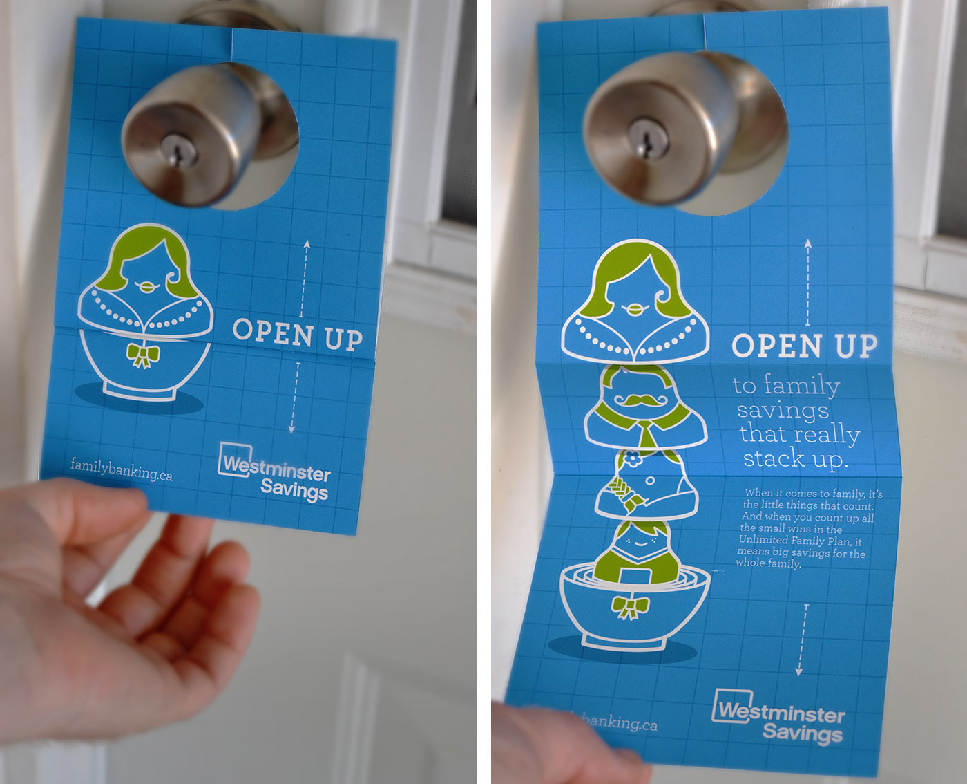
Banking bundles were a completely new concept. We needed a simple visual mnemonic that encapsulated the idea. We launched with the key image of the matryoshka.
The initial campaign was so successful that the credit union asked us to rebrand the institution. The styleguide facilitated early buy-in across the credit union, while ensuring consistency across channels.
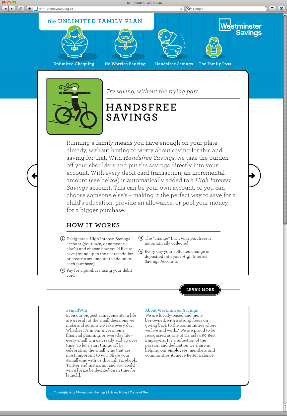


We continued to develop the brand identity to support new campaigns and guide in branch collateral. Westminster Savings continued to use this brand identity till well after it merged with Prospera Credit Union in 2020.